Nebo — Brand Strategy & Visual Identity
Duh u boci, the distillery behind Old Pilot’s Gin, approached us to develop Nebo, Croatia’s first small-batch whiskey brand. Working closely with the founders, we created the name, brand strategy, visual identity and packaging, giving Nebo a distinctive character within the distillery’s wider brand universe. A custom telescope-inspired bottle and intricate gold illustrations brought the concept to life, helping establish Nebo as a creative and commercial success. The project earned Bronze at IdejaX 2026 and recognition at the SIP Bottle and Packaging Design Awards.
ServicesBrand strategy, branding, visual identity, logo design, brand storytelling, naming, brand collateral, Packaging design, Product design and Brand consulting.
Read more ↓Read less ↑
Nebo — Brand Strategy & Visual Identity
How we brought the spirit of exploration to Croatia’s first small-batch whiskey brand
The Client & The Challenge
Building a bold new chapter in Croatian spirits, from name to bottle.
Duh u boci distillery, the makers behind the internationally recognized Old Pilot brand, have recently launched Nebo—Croatia’s first-ever range of small-batch whiskey. Featuring whiskey editions such as Four Grain, Single Malt, and Peated Single Malt, Nebo combines both locally and internationally sourced ingredients with expert know-how, creating a brand that is authentic, daring, and sophisticated.
Our goal was to create a distinctive visual identity and packaging system that aligned seamlessly with the makers’ broader umbrella brand and long-term vision. The challenge was to balance innovation with tradition while aligning technical precision with emotional storytelling.
The Creative Approach
Where shared ambition meets the art of exploration.
Developing the Nebo brand meant navigating uncharted territory. The process involved strategic planning, outside-of-the-box thinking, and close collaboration to create a brand that communicated boldness while remaining refined and premium.
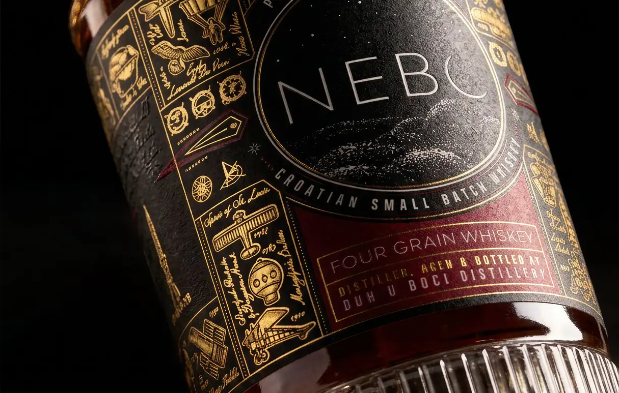
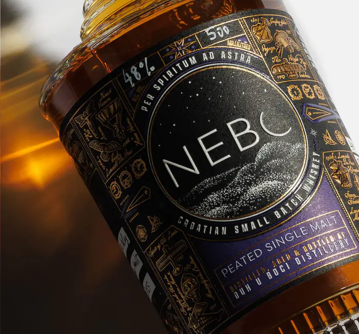
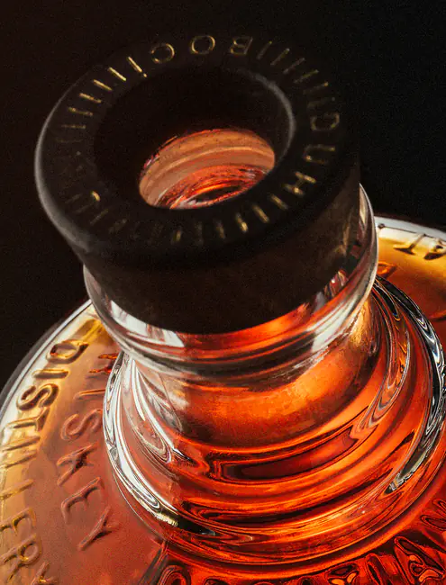
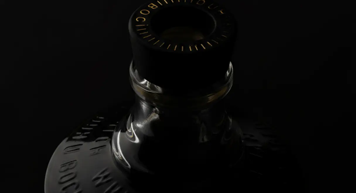
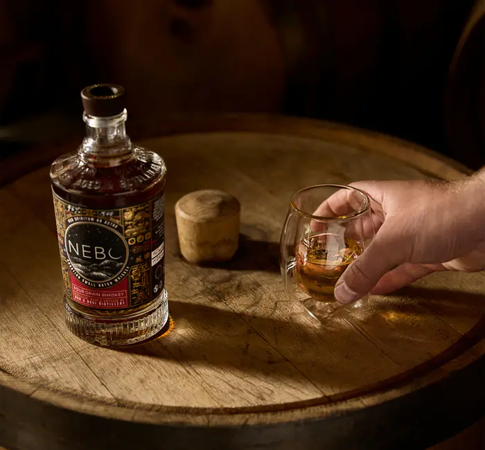
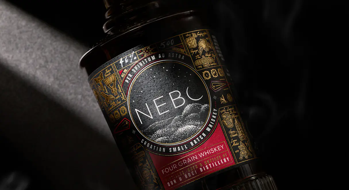
We shaped Nebo from the ground up, developing its name, brand strategy and visual identity around a shared passion for aviation, craftsmanship and exploration. Inspired by the idea of looking beyond the horizon, we prototyped a custom bottle shaped like a telescope, paired with a matte black label and intricate embossed gold illustrations celebrating mythology and aviation pioneers. The logo’s crescent-moon detail connects the identity to nebo, the Croatian word for sky, bringing the brand concept to life through thoughtful design.
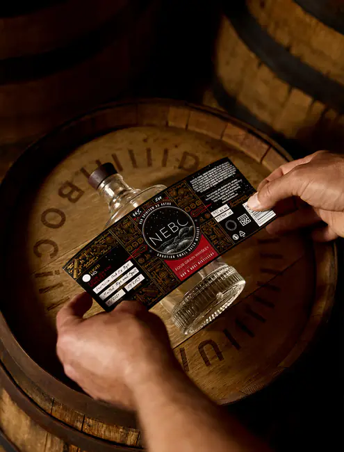
We extended this creative direction across the packaging system, introducing signature colours for each whiskey expression and handwritten batch notes that reflect the personal nature of small-batch production.
The Result
A bold, cohesive brand with its sights set on the future.
The outcome is a visual identity that celebrates human aspiration and innovation. By combining strategic thinking with close collaboration, we helped transform the founders’ vision into a tangible brand experience, giving Nebo whiskey a recognisable presence on the market.
Nebo’s distinctive approach to branding and packaging has earned recognition at both national and international levels. The project received Bronze in the Small Batch Packaging category at IdejaX 2026 and recognition at the SIP Bottle and Packaging Design Awards, affirming the impact of its bespoke bottle and narrative-led visual identity. The whiskey itself has also made its mark internationally, with NEBO Whiskey Peated Single Malt (Flight #2) winning Gold at The World Whisky Masters 2026. Together, these achievements highlight the strength of a brand built through close collaboration, strategic thinking and a creative vision that extends from the spirit inside the bottle to every detail of its presentation.