Interliber — Rebranding & Visual Identity
Every great story deserves a cover that invites you in. As one of Croatia’s best-known cultural events, Interliber has brought books, authors and readers together for decades. The challenge was to give this much-loved book fair a fresh visual identity while preserving its familiar spirit. Inspired by the universal symbol of an open book, we developed a concept centred on openness to discovery, curiosity and connection. The new identity reflects the fair as a meeting place for ideas, cultures and generations, expressed through a distinctive logo, vibrant colour palette and flexible visual system.
ServicesBranding, visual identity, logo design and brand collateral
Read more ↓Read less ↑
Interliber — Rebranding & Visual Identity
Turning a new page for Croatia’s biggest book fair with a fresh identity.
The Client & The Challenge
Giving an old favourite a new cover
Interliber is Croatia’s largest book fair and one of the region’s most significant cultural events. The annual event brings together publishers, booksellers, authors and readers at the Zagreb Fair, celebrating the world of literature while creating opportunities for discovery, exchange and connection.
With a long-standing tradition and an increasingly diverse audience, Interliber needed a visual identity that would reflect the evolving nature of the publishing industry while strengthening its position as a leading platform for books and culture. Our challenge was to develop a contemporary and recognisable identity that would appeal to audiences of all ages, balance tradition with innovation, and translate seamlessly across the fair’s many communication channels.
The Creative Approach
Rewriting the story, redefining the look
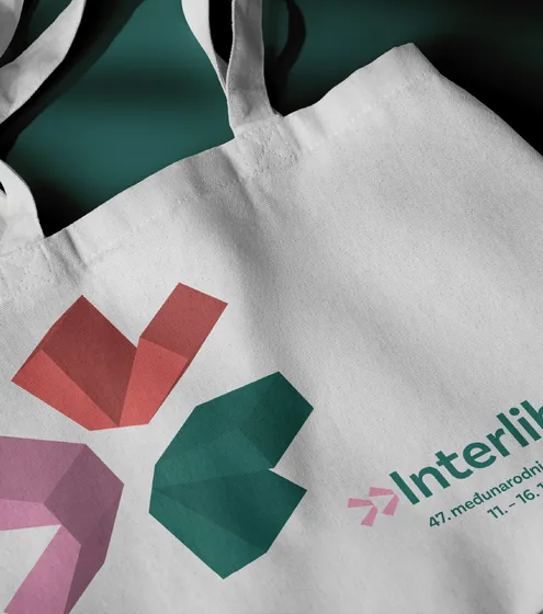
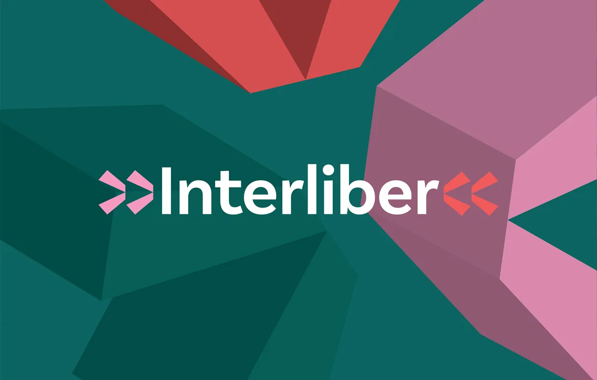
The concept behind the new Interliber identity draws inspiration from two of the most universal symbols of knowledge and literacy: the written word and the open book. At its centre is a stylised interpretation of an open book, reimagined through a clean, minimalist form that becomes the foundation of the logo. More than a reference to literature, the symbol represents openness — to knowledge, new ideas, imagination, creativity, different cultures, languages and generations.
The identity also plays with the familiar expression “never judge a book by its cover”, placing content before appearance and encouraging a deeper appreciation of the ideas and stories within. In this sense, Interliber is presented not simply as a book fair, but as an open space for discovery, dialogue, self-expression and connection.
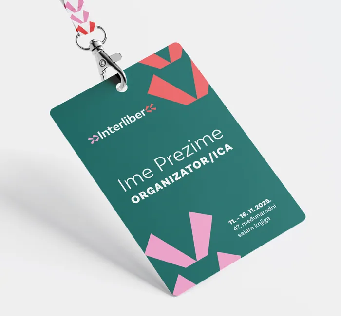
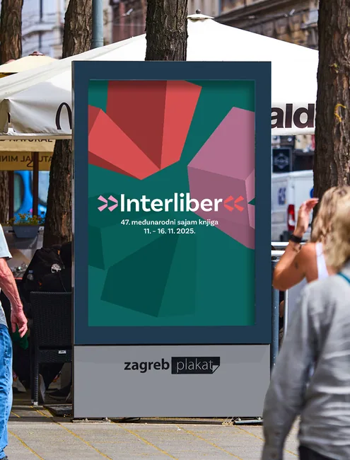
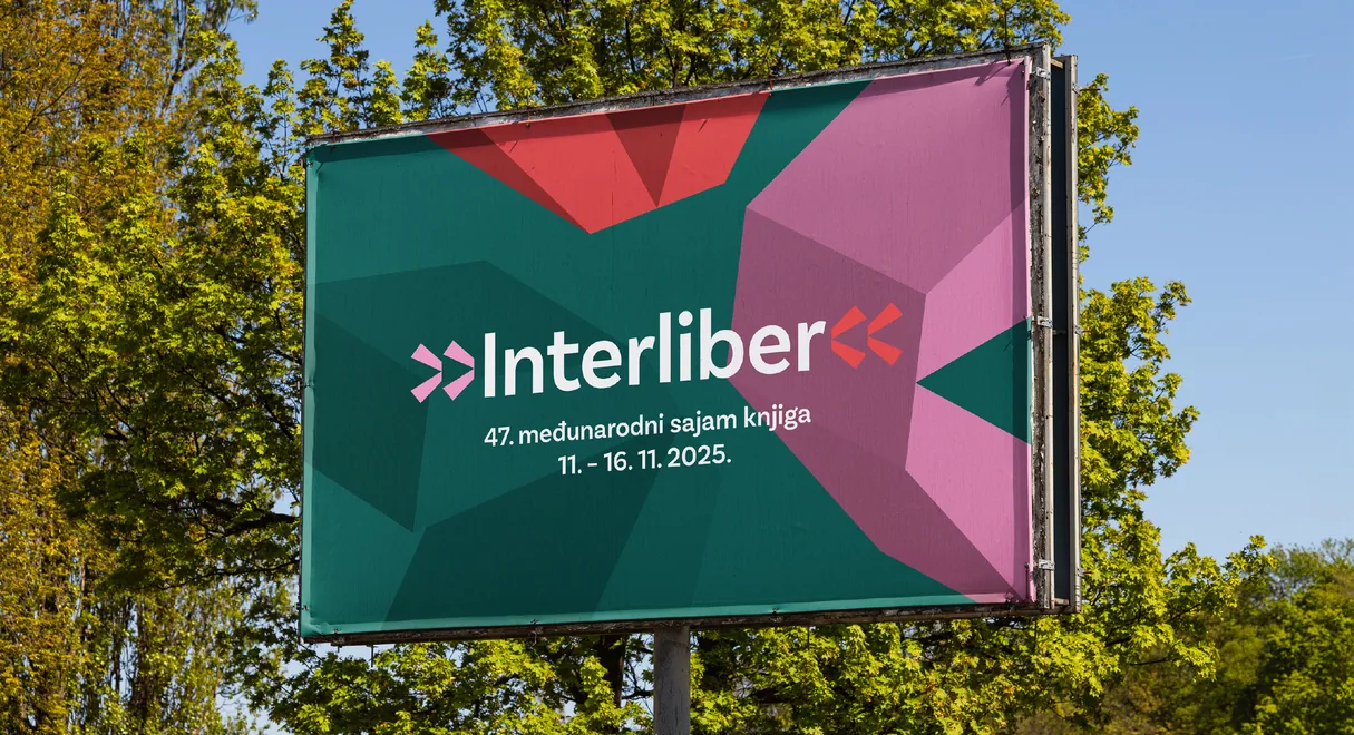
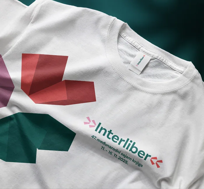
Visually, we embraced a contemporary minimalist approach, combining clean lines, functional typography, generous negative space and a bright, uplifting colour palette. The identity was designed as a cohesive system, adaptable across a wide range of applications, from key visuals and promotional materials to digital communication and on-site signage. Particular attention was given to maintaining clarity and consistency while allowing enough flexibility to accommodate partners and sponsors without compromising the overall composition.
The Result
A Bold New Chapter for a Beloved Book Fair
The proposed visual identity gives Interliber a contemporary visual voice while preserving the values and cultural significance that have defined the fair for decades. Rooted in the symbolism of an open book, it creates a recognisable and versatile brand system that speaks to both long-time visitors and new generations of readers.
By translating the concept into a cohesive identity across different applications, we helped give the fair a stronger and more distinctive visual presence. The result is a thoughtful rebranding that builds on Interliber’s established identity while opening the door to new audiences and future possibilities.